
The secret ingredient to create impactful charts
Tip #6

Show contrast.
Let me illustrate this to you with the help of 7 charts.
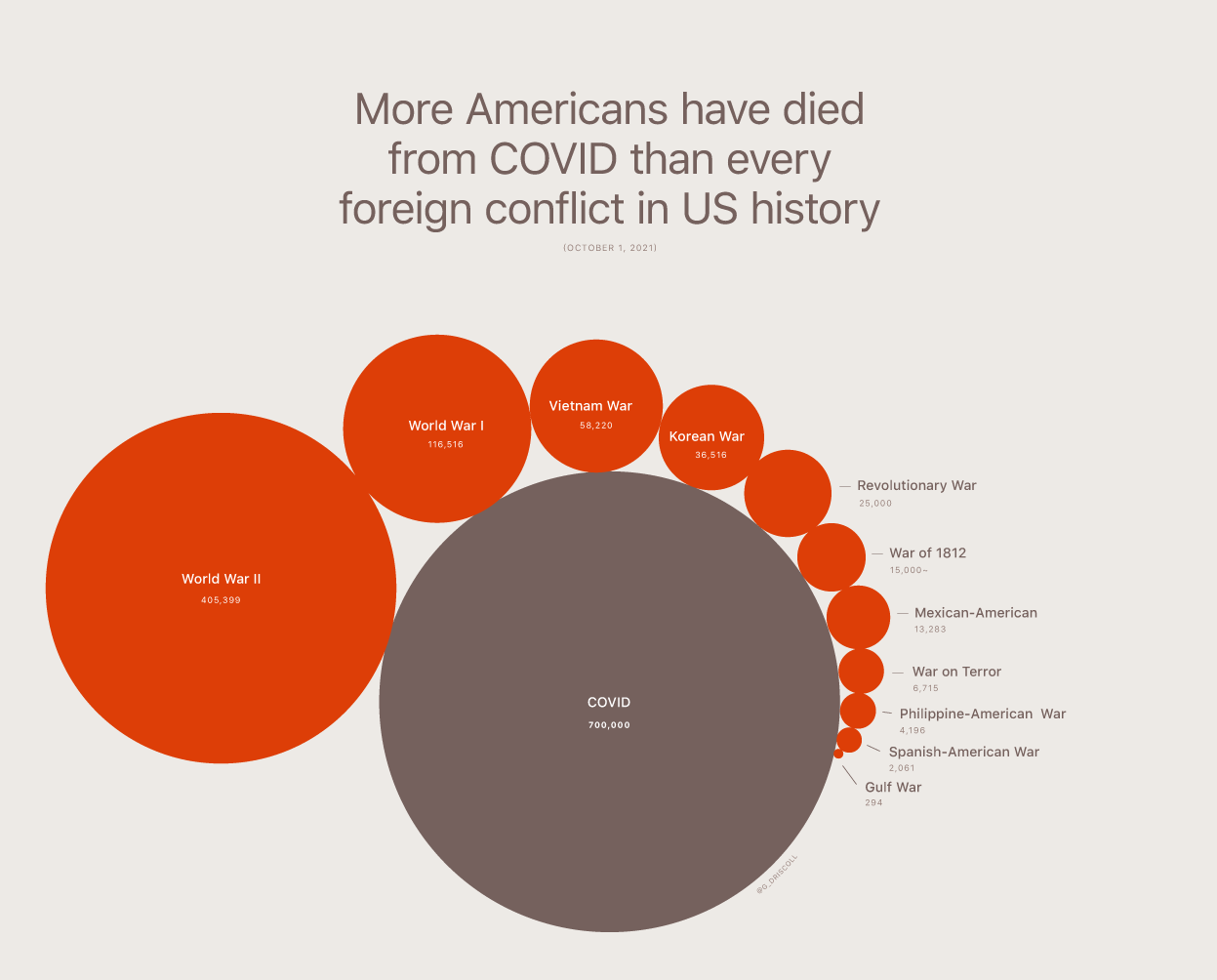
1. We all know that US was hit hard by Covid. But how hard?
2. We all know that Microsoft Teams is a super successful product. But how successful?
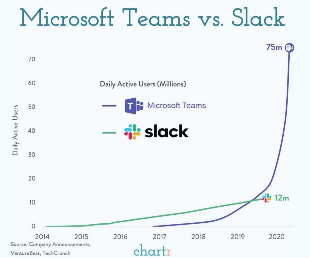
Source: Chartr
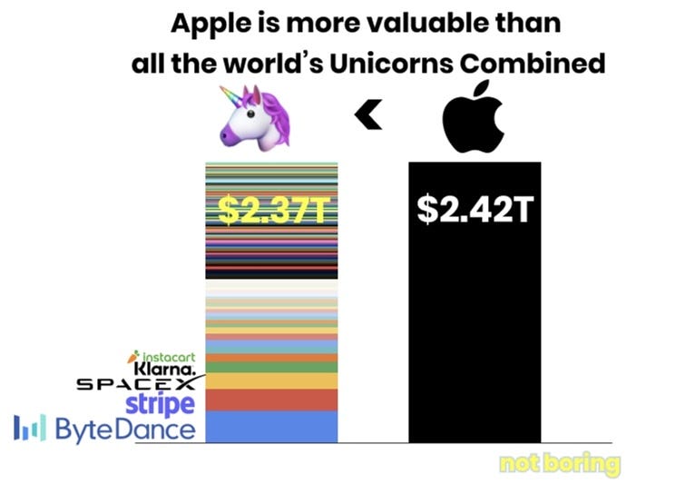
3. We all know that Apple is a large organization. But how large?
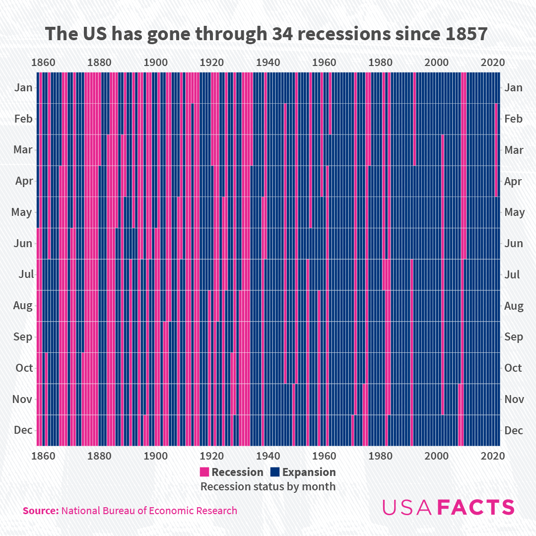
4. We all know that US goes through a recession every few years. But how frequent?
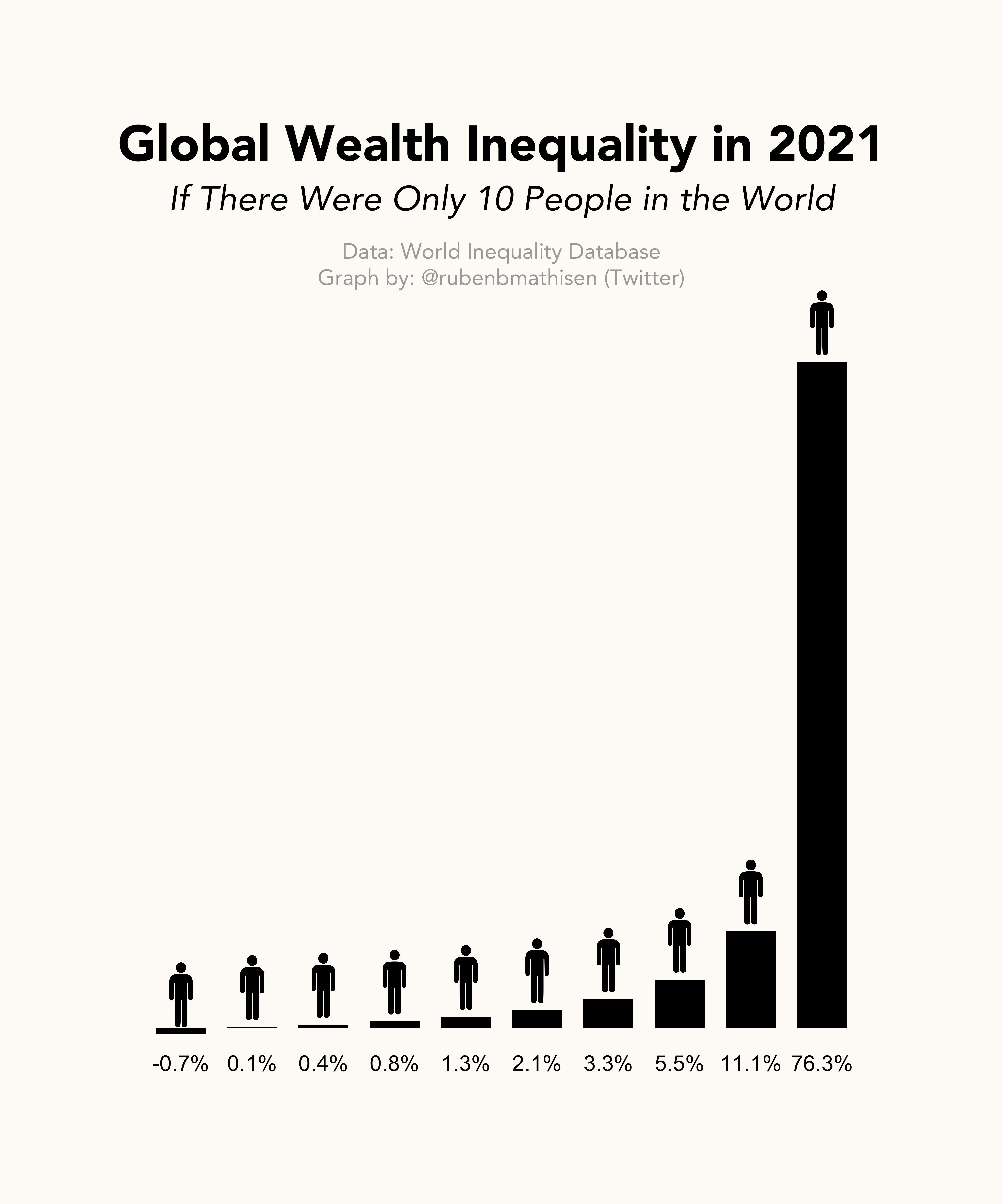
5. We all know that we live in an unequal world. But how unequal?
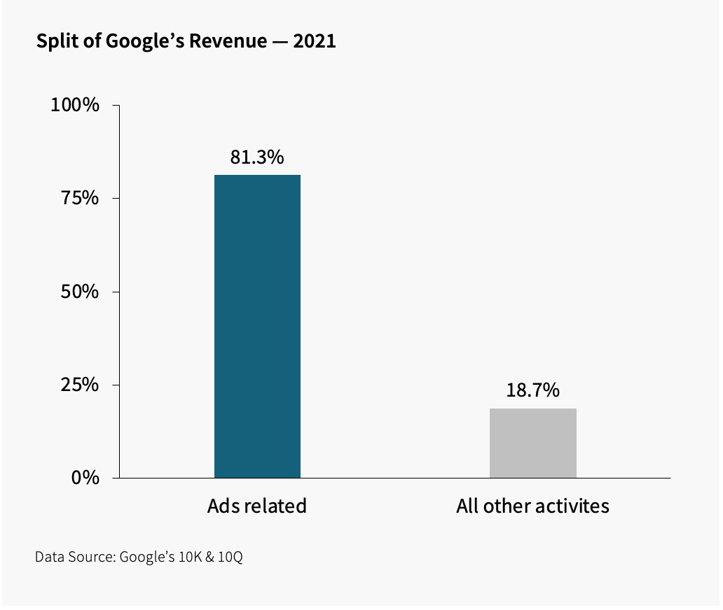
6. We all know that Google makes money through Ads. But how much?
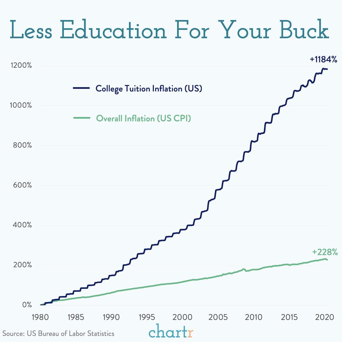
7. We all know that college education in the US has gotten expensive. But how expensive?
Each chart in there tells a story in itself. The secret ingredient? Contrast.
In life, we are told not to compare. But in data, it’s exactly the opposite.
You should always compare.
Compare data with previous years’ data
Compare data with expected data
Compare data with industry data
Compare data with any other sensible data you can find
Comparison is what makes your data viz powerful. Without comparison, you miss the context. And context is very important in data.
So that was one small but actionable data storytelling tip for this week.
Ciao, until next week!
PS: Did you also notice that each of the above charts only shows one idea per chart?
Loved how the charts are able to convey the intended information!