One idea per chart
Tip #5
👋🏻 Hey, Sid here!
Welcome to another edition of Datadino Storytelling!
Today, I share with you a simple yet powerful tip. It’s to convey just — “one idea per chart”.
Let me illustrate this for you.
Imagine that your boss has asked you to create a presentation.
She wants to know who are the biggest players in the semiconductor industry. And how has their market share trended over the years?
You research and gather the data. And come up with the below stacked bar chart. Well done!
It’s neat. It’s catchy. And has a great colour choice.
So what’s wrong? Try getting to the takeaways.
What all can you decipher?
First, you can clearly tell that Initech’s market share has been stable over the years. You can also tell that Initech is the largest player in the market. What else?
Maybe, you can also tell that Pied Piper has been gaining market share. But, what else?
Frankly, other than that it’s hard. You really need to dig into the chart to get to other takeaways.
Don’t make it so hard. Make it easy. Convey just “one idea per chart”.
Let’s look at the same data but now split it into four different charts.
The 1st chart shows you the market share in the semiconductor industry in 2022.
As before, you can clearly tell that Initech is the largest player in the market. But not only that, you can now also tell that Monsters Inc is the 2nd largest and Hooli is the smallest (a fact that wasn’t so obvious in the previous chart).
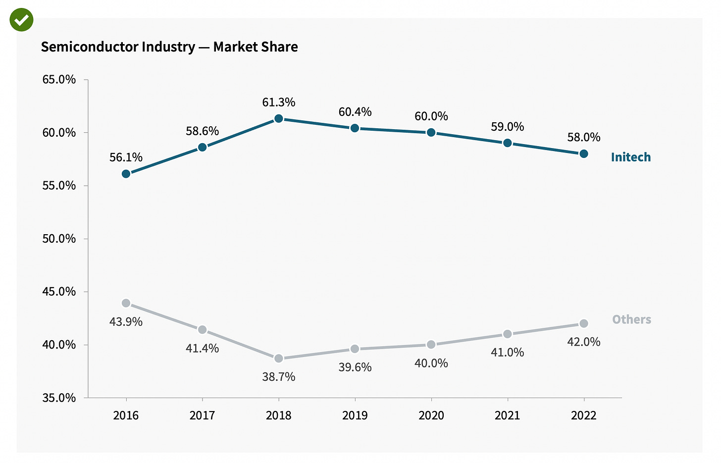
The 2nd chart shows the trend for Initech’s market share.
Initech has comfortably maintained its lead all along. Although, you now start to notice that there has been a small dip in Initech’s market share in the last 5 years.
The 3rd chart goes into the details around the market share for Pied Piper & Hooli. It shows how Pied Piper has been gaining market share while Hooli has been losing market share.
And the 4th one (not as insightful) shows you that both Monsters Inc & Acme Corp have maintained stable market share over the years.
As always, let’s take another example from the industry.
The below chart is from Carta. They put out wonderful reports on the state of private capital markets. And incorporate some of the best data viz practices.
But this chart in particular — I find it hard to read. There are multiple takeaways in the chart that I find hard to get to.
Instead, why not split the chart into three separate charts with key actionable takeaways for each?
Takeaway 1: Of the total money that flowed into the startup land last quarter, Series A, B & C startups got the most followed by Series E+, Series D & Seed stage.
Takeaway 2: In recent quarters, funding has been tight for late-stage startups. The proportion of funding going into late-stage startups (pink line) has dropped from 63% of the total in Q1 ‘21 to 47% now.
Takeaway 3: Series D, E & B rounds have experienced the steepest drop in cash raised in Q2 ‘22 compared to Q1 ‘22.
Voila!
So next time you are creating a complex chart, ask yourself — how can you distill the chart down to just one key takeaway?
If you need some more inspiration, head over to Chartr, who do a great job with their charts.
Ciao, until next week!


