👋🏻 Hey, Sid here!
Welcome to Datadino! I share one small actionable tip every week to help you level up your data storytelling skills. In case you missed it, find the last week’s tip here.
Without further ado, let’s jump straight into this week’s tip.
Spotify recently hosted its Investor Day. One of the charts that caught my attention was the churn rates for different companies. Here is the graph. What’s wrong with it?
Did you find anything? No?
My friend, you need to start developing a nosy attitude to bad data viz.
On the surface, all seems well. The title is large & clear. There is a legend that tells you which line is which. And everything seems to be labeled.
It’s only when you want to get into the details that you start to see the problems.
Try figuring out what’s the churn rate for iHeartRadio. And how has it trended? Now you get me? It’s a nightmare to figure out.
All the lines are so similarly coloured it’s hard to figure out which is which. On top of it the prominent white gridlines just add to the noise. Then you need to constantly go back and forth with the legend trying to remember which colour represents what company. Ugh!
Why does it need to be so hard? It doesn’t. This brings me to this week’s tip. Always bring the labels closer to the data.
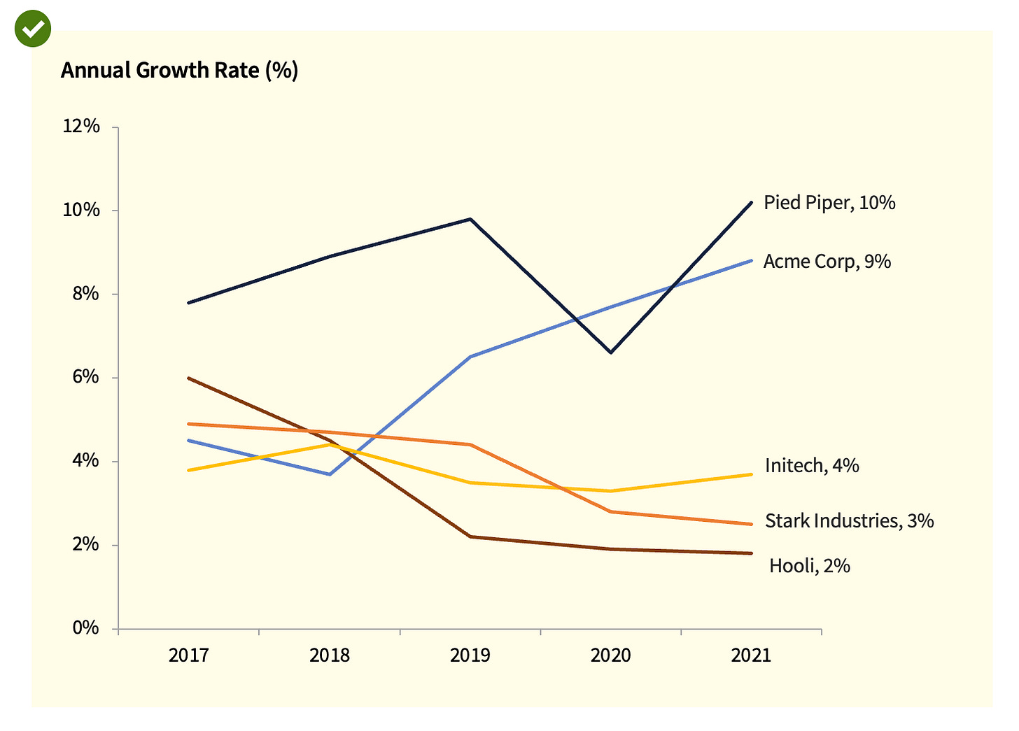
Let me illustrate it for you. The below chart shows you the growth rate of 5 different companies over the span of 5 years.
Let’s make one small adjustment. Remove the legend from the top and add data labels on the lines instead.
Isn’t this much easier to read?
Let’s take another practical example from the industry. The chart below is from AngelList.
Same problem. Same solution. Easy!
Just one small change makes such a difference.
Let’s take it even one step further and add colours on the data labels as well.
Better?
Let me end this with a best practice example from BBC. I love how they match the colours on the labels and give the last data point value 🙌.
So that was one small actionable tip for this week. I hope you found it insightful. Until next week, ciao!


