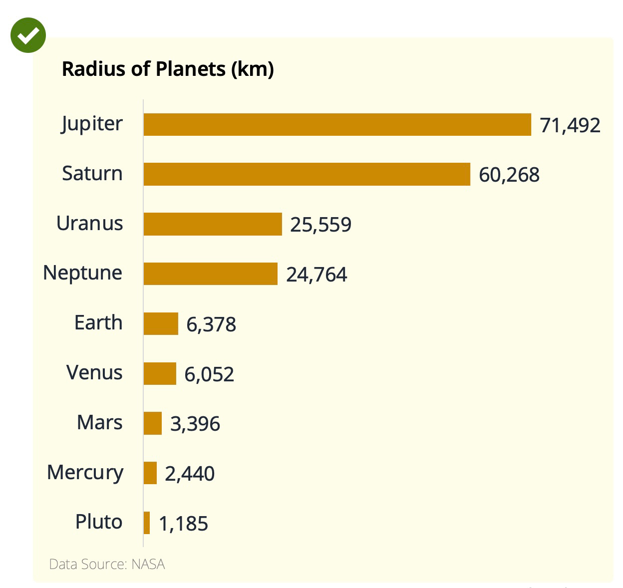
Sort bar charts to make it easier to grasp takeaways
Tip #1
The chart below shows you the radius of all the planets in the solar system. Try figuring out which is the 2nd smallest planet.
Now try again using a sorted bar chart. Isn’t it quicker?
As a best practice, you should always sort bar charts. It reduces the cognitive load and lets you grasp the takeaways quicker.
Now, let’s take another practical example from the real world.
The chart below shows you things that VC investors care more/less about in 2022 vs last year. It’s from one of my favourite investors — Christopher Janz.
The chart (and the whole blog post) in itself packs great insights. But guess what, it can be even more powerful.
Sorting the bars would have made it much easier to grasp the key takeaways.
Investors care more about capital efficiency and valuation in 2022 vs in 2021. Voila!


Good stuff, Sid. I would like to connect with you, any way to get in touch?