👋🏻 Hey, Sid here!
Welcome to another edition of Datadino Storytelling!
This week, I discuss bubble charts and why you should avoid them.
Let’s jump straight in.
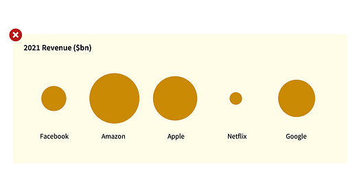
The chart below shows you the revenue for FAANGs in 2021.
Try figuring out three things.
First, which company has the largest revenue? Easy — it’s Amazon.
Next, which company has the 2nd largest revenue? Easy again — it’s Apple.
Finally, guess how much bigger is Amazon compared to Apple? Difficult right?
Same data. Same questions. But now let’s look at the data in a bar chart.
Which company has the largest revenue?
Which company has the 2nd largest revenue?
Guess how big is the largest company compared to the 2nd largest?
I bet it was easier to answer those questions using the 2nd chart.
So there you have it Bar Chart > Bubble Chart.
But why? Eitan Lees has a great explanation.
Compare the area of circles below.
It’s difficult.
Now, compare the length of the bars below.
It’s easy.
Our human brain isn’t great at comparing circular areas. On the other hand, it’s great at comparing heights & lengths.
So for that reason, you should prefer bar charts over bubble charts.
Now, let’s take a few examples from the industry.
The chart below is from McKinsey. It shows you the likelihood of dying from Covid for general vs vulnerable populations.
There is nothing wrong with this chart. But isn’t the bar chart easier to read?
One more.
The chart below is from one of the leading newsletters, Finshots. It shows the biggest IT companies in the world by brand value.
Again, nothing wrong.
But isn’t the bar chart version easier to read?
The logos are all aligned well. And you can infer more takeaways (eg. Accenture is a little more than double the size of TCS).
It even takes less time to create.
So that was one small data storytelling tip for this week.
Are you liking this series? I’d love to know. Send me a message or leave a like/comment.
PS: If you’re still wondering how big is Amazon compared to Apple — it’s 28.4% bigger (in terms of revenue). Did you get it right?


